Color system
The color system is arguably the most important part of Design Tokens. If you’re unsure about how to organize and name color variables, shadcn/ui’s naming convention is a great starting point:
Generally, background is used for background colors, foreground is used for text colors. When background is used for a component’s background color, such as colors/card/DEFAULT1, the background suffix is omitted. From this foundation, you can gradually expand to more variables:
shadcn/ui color variable naming reference
colors/background/DEFAULT- Main page background colorcolors/foreground/DEFAULT- Main text colorcolors/muted/DEFAULT- Secondary background color, used for subtle visual hierarchycolors/muted/foreground- Secondary text color, used for auxiliary informationcolors/popover/DEFAULT- Popover background color, ensure proper distinction from main backgroundcolors/popover/foreground- Popover text colorcolors/card/DEFAULT- Card background color, used for content blockscolors/card/foreground- Text color within cardscolors/border/DEFAULT- Border color, used to separate visual elementscolors/input/DEFAULT- Input field border colorcolors/primary/DEFAULT- Brand primary color, used for main buttons and key elementscolors/primary/foreground- Text color on primary colorcolors/secondary/DEFAULT- Brand secondary color, used for secondary actions and interface elementscolors/secondary/foreground- Text color on secondary colorcolors/accent/DEFAULT- Accent color, used to highlight specific elementscolors/accent/foreground- Text color on accent colorcolors/destructive/DEFAULT- Warning color, used for dangerous actions and error notificationscolors/destructive/foreground- Text color on warning colorcolors/ring/DEFAULT- Focus ring color, used for interaction feedback
Top-level directory
Please use colors or color as the top-level directory for all color-related variables. This not only makes your variable structure clearer but also ensures perfect compatibility with Tailwind CSS.
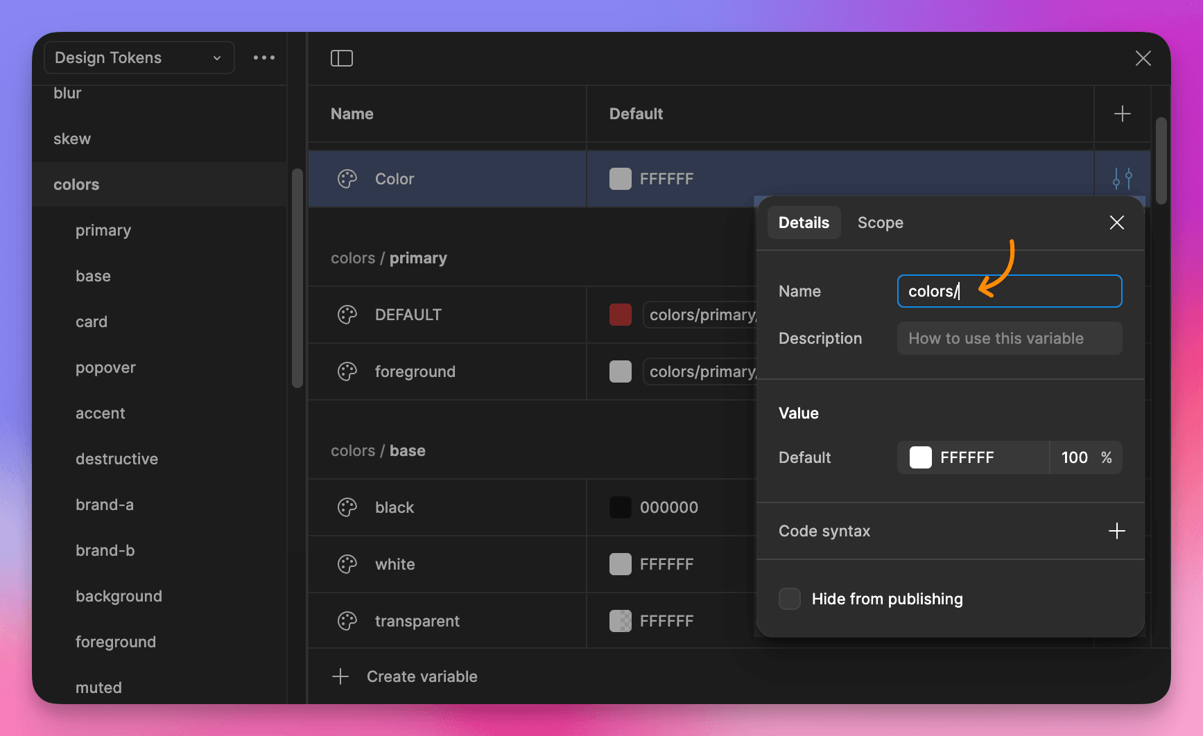
Organizing color variables
Create color palettes
In a Design System, we often use a series of color palettes as atomic variables, such as colors/blue/400, colors/red/300, etc. To create such palettes and use them in the development environment, you need to follow the rules of the top-level directory, placing them under the colors or color directory in Figma Variables. For example:
Blue palette
colors/blue/50colors/blue/100colors/blue/200colors/blue/300colors/blue/400colors/blue/500colors/blue/600colors/blue/700colors/blue/800colors/blue/900colors/blue/950
Red palette
colors/red/50colors/red/100colors/red/200colors/red/300colors/red/400colors/red/500colors/red/600colors/red/700colors/red/800colors/red/900colors/red/950
Or from a simple starting point:
Blue palette
colors/blue
Red palette
colors/red
Use color palettes
In Figma, reference higher-level color palettes, such as:
colors/primaryreferencescolors/blue/500colors/secondaryreferencescolors/red/500
Opacity modifiers
Variables Xporter provides powerful color processing capabilities, automatically generating color variables that comply with Tailwind CSS rules. During development, you can easily use opacity modifiers to flexibly adjust the transparency of colors without the need for additional variable definitions.
<!-- Text opacity adjustment -->
<div class="text-primary/80">Text opacity adjustment</div>
<div class="text-secondary/60">Text opacity adjustment</div>

<!-- Background opacity adjustment -->
<div class="bg-primary/10">Background opacity adjustment</div>
<div class="bg-accent/90">Background opacity adjustment</div>

<!-- Border opacity adjustment -->
<div class="border-2 border-primary/30">Border opacity adjustment</div>
Footnotes
-
The
DEFAULTkeyword is a way to organize variable hierarchy, learn more ↩